
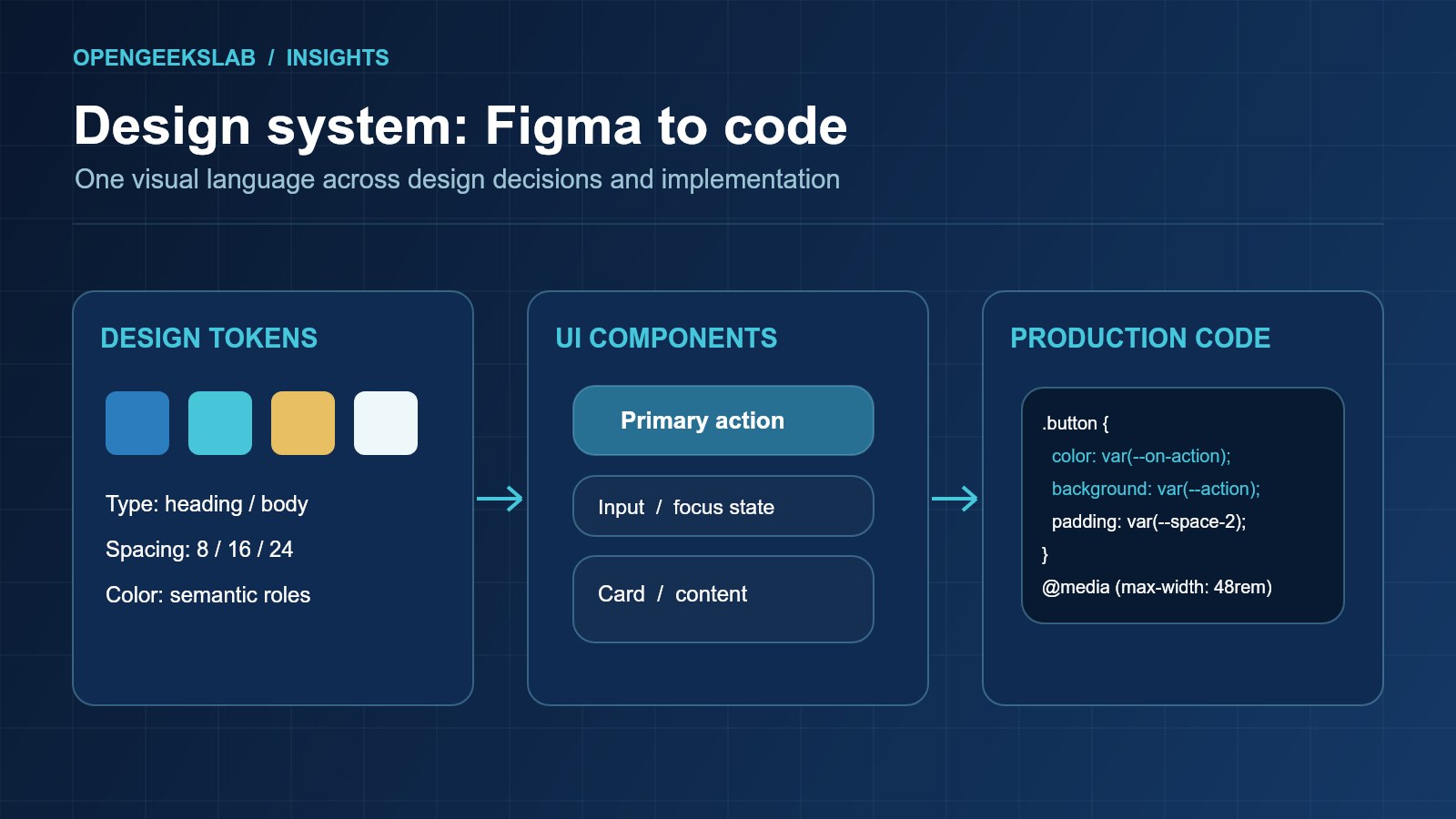
Direct answer: A Figma design system stays aligned with code when the team defines shared tokens, maps each approved component to a production implementation and reviews changes in both directions. Ownership, accessibility states and versioned release rules matter as much as the component library.
Diagnose the drift before adding tooling
Design drift appears when a file shows one button while production has several variants, when spacing values multiply or when a new interaction reaches code without a corresponding design state. Inventory the high-use components first. Record their names, variants, states, tokens and owners in both Figma and the codebase. Compare actual product screens, not only the ideal library. The objective is to identify which decisions are shared and which are intentionally product-specific.
Choose a token model teams can maintain
Define colors, type, spacing, radii and motion at a semantic level. A token named for its role is easier to change across light and dark surfaces than a collection of copied hex values. Map design variables to code variables through a documented process, and keep a review step for changes that affect contrast or layout. The W3C CSS custom properties specification describes the browser mechanism used by many web token systems. It provides a useful implementation primitive, while the product team still needs naming and governance rules.
Map components and all their states
For each reusable component, document its purpose, properties, states and behavior. Include disabled, loading, error, empty and responsive states where relevant. A static default frame cannot specify how a form behaves when validation fails. Set a rule for when a new variant belongs in the shared system and when a product-specific composition is more appropriate. Keep the component API narrow enough that designers and developers can recognize the same intent.
Make accessibility a shared acceptance criterion
Use keyboard order, focus visibility, text contrast, target size and clear labels as design and implementation requirements. The W3C Web Content Accessibility Guidelines provide the relevant success criteria and supporting techniques. Review accessibility before a component becomes the default pattern; fixing a shared component later means revisiting every product that uses it. Test behavior in the browser as well as the design file, especially for menus, dialogs and forms.
Create a two-way change process
A designer proposing a new component should link a product need and identify affected screens. A developer discovering a production exception should flag it back to design before the exception becomes a second standard. Use a small change record: rationale, token or component diff, affected products, accessibility review, migration notes and owner. During release, confirm that the shipped component and approved design represent the same state. When a component changes, document whether consumers need to migrate immediately or can use the previous version for a period.
Measure alignment through real work
Track duplicate components, unreviewed overrides, unresolved production exceptions and the time needed to implement a common pattern. Those measures help target maintenance effort; a perfectly tidy library that slows delivery is not the goal. Start with navigation, forms and calls to action because they appear in many journeys. Our branding and design systems service can establish the shared patterns, while our product development guide shows how design decisions connect to implementation.
Frequently asked questions
Should every Figma component have a one-to-one code component?
No. Some design components are visual compositions, and some code primitives are internal. Map the reusable product behavior and document intentional differences.
Who owns design system changes?
Name owners in design and engineering, with a shared review for changes that affect product behavior, accessibility or migration.
Can tokens prevent all visual drift?
No. Tokens reduce value mismatch, but layout, content, responsive behavior and interaction states still require review on real screens.